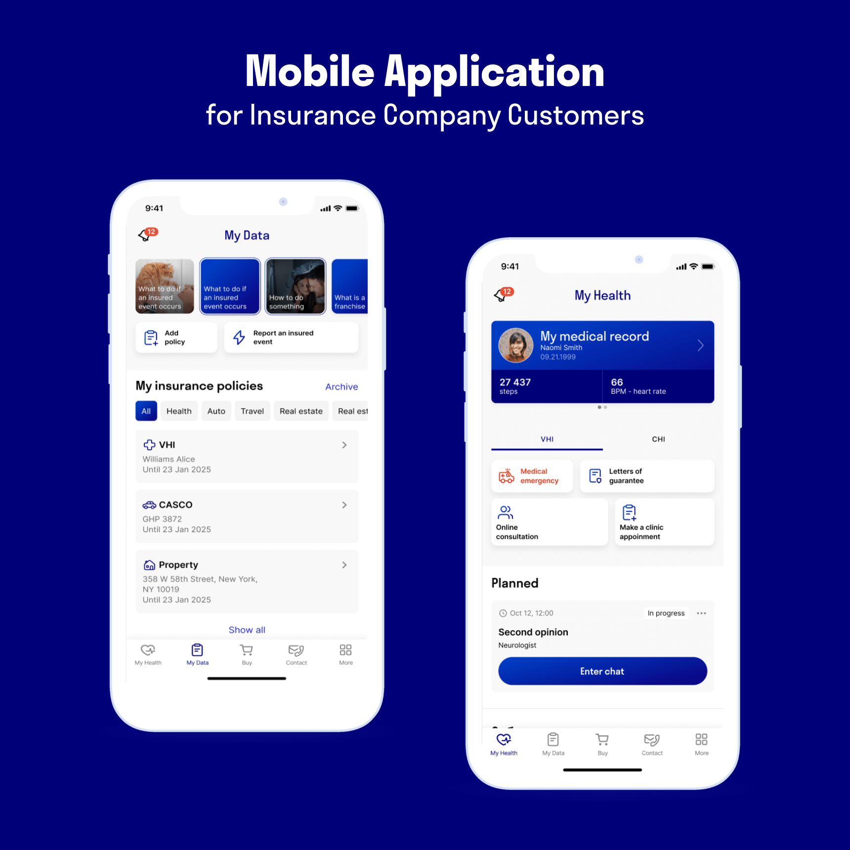
Online Health Diagnostics – Health and Insurance app
Online biological condition diagnostics in Health and Insurance app
About product
Health and Insurance mobile app features a large number of preventive medicine services. On our part, we were tasked with the business analytics and design of online general client health diagnostics.
The company’s primary business objective was to promote the checkup service. A checkup is a comprehensive diagnosis of the body, one of the best ways to get the most complete information about a person’s health. Medical centers offer a basic health checkup, which helps detect risks in developing common diseases. You can also undergo a specialized checkup to examine the organs of the cardiovascular, digestive, nervous, and other systems.
Employers buy VHI policies for their employees. Clients can use them to undergo checkups at a bargain discount. The Insurance Company has its own medical expertise – more than 40 major specialty doctors and multidisciplinary medical centers. You can also undergo a checkup at partner locations, as the company cooperates with 10,000 clinics.
The app required the following:
– To inform clients of the opportunity to undergo a checkup at a discount. Not every client knows about this option, and it can be problematic to study a long contract with all the terms and conditions on your own.
– To popularize checkup services in general, as people are not yet accustomed to undergoing such programs and more commonly take tests separately.
4 persons
5 months

What was the task
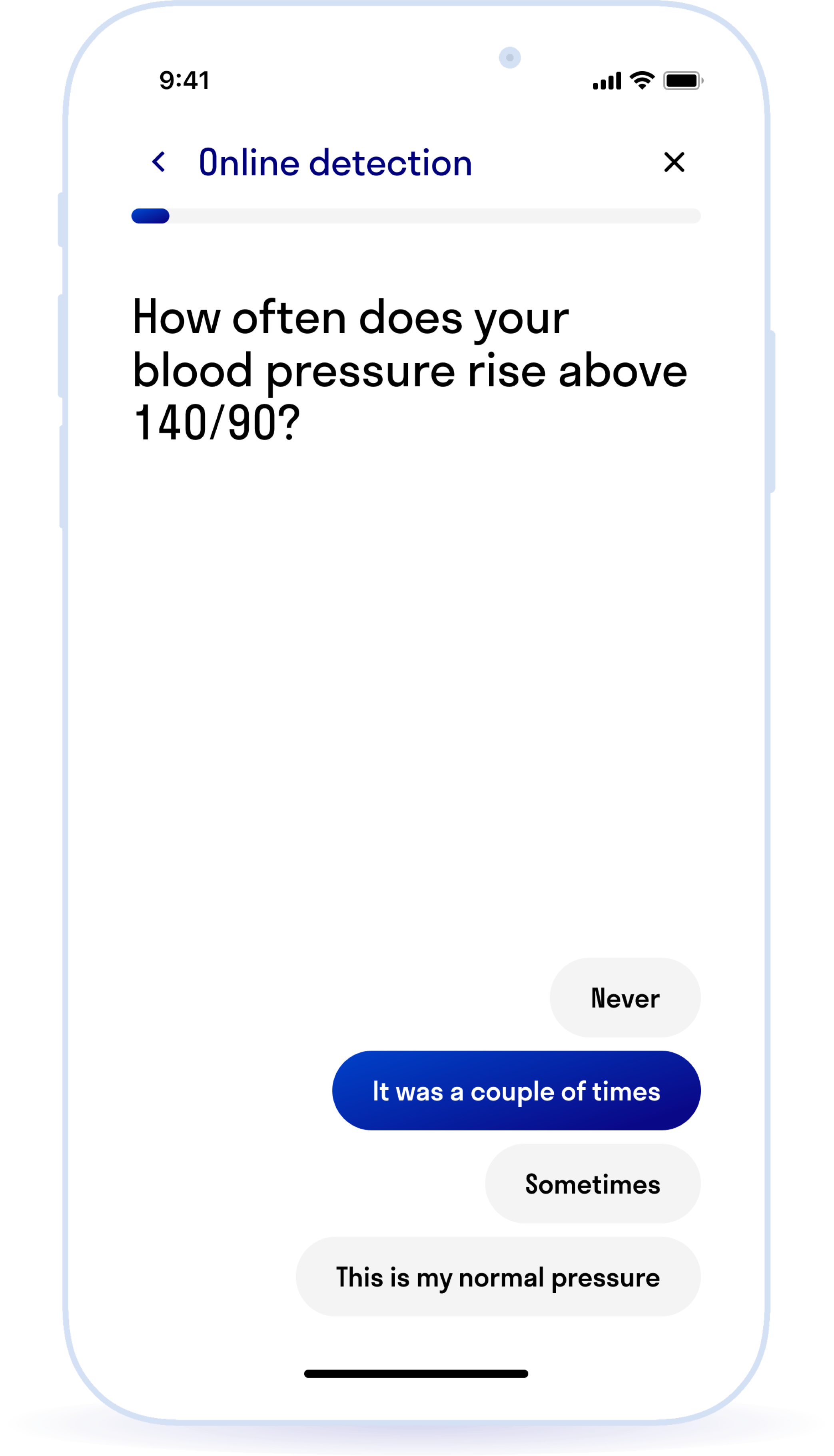
To solve the problem, a questionnaire was developed along with the Insurance Company’s doctors. The questions help to find out the general state of a person’s health, for example: “How big is your home medicine cabinet?”, “Do you have a tonometer at home?”, “How often do you measure your blood pressure?”, or “How often do you drink alcohol?”.
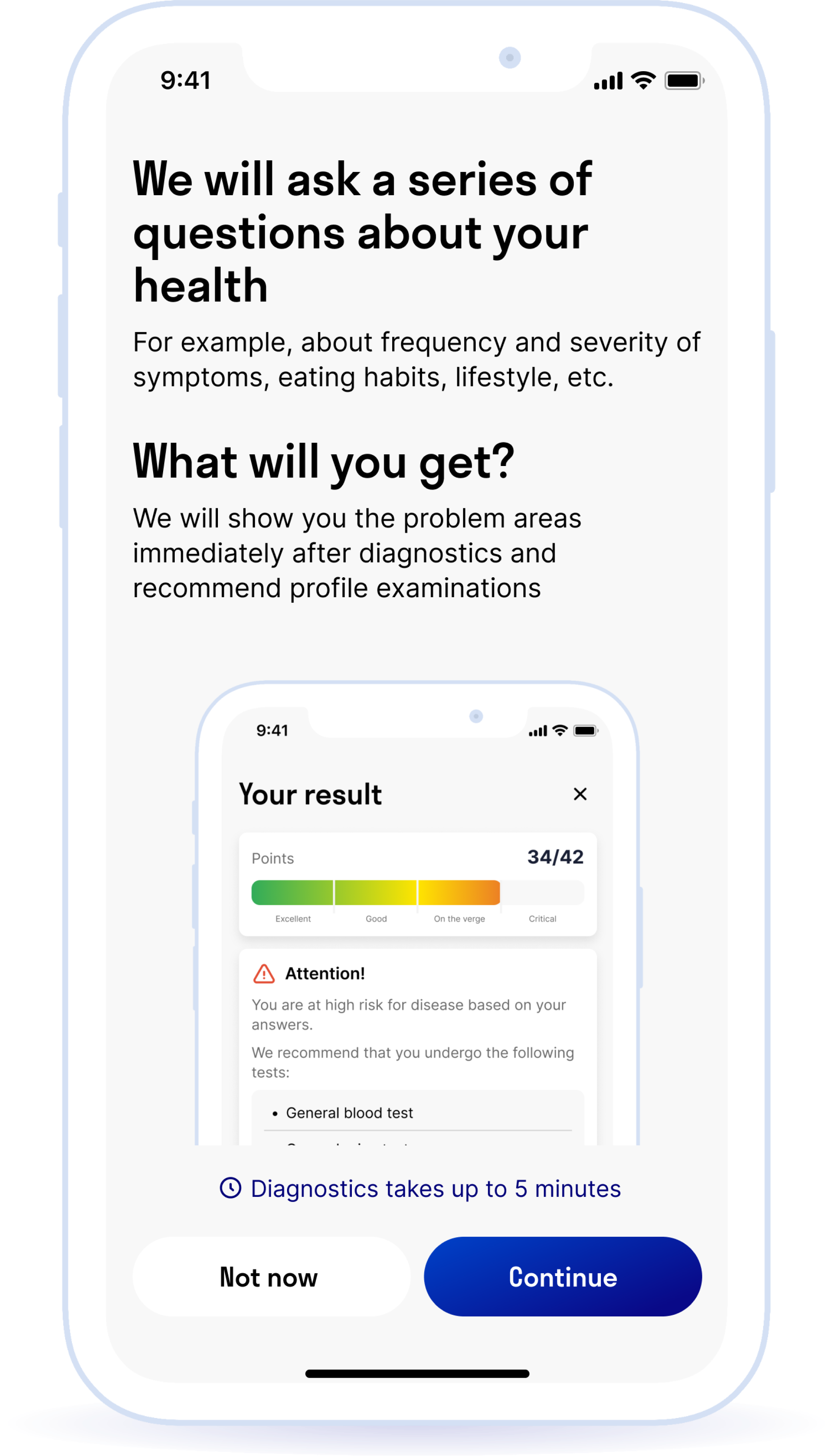
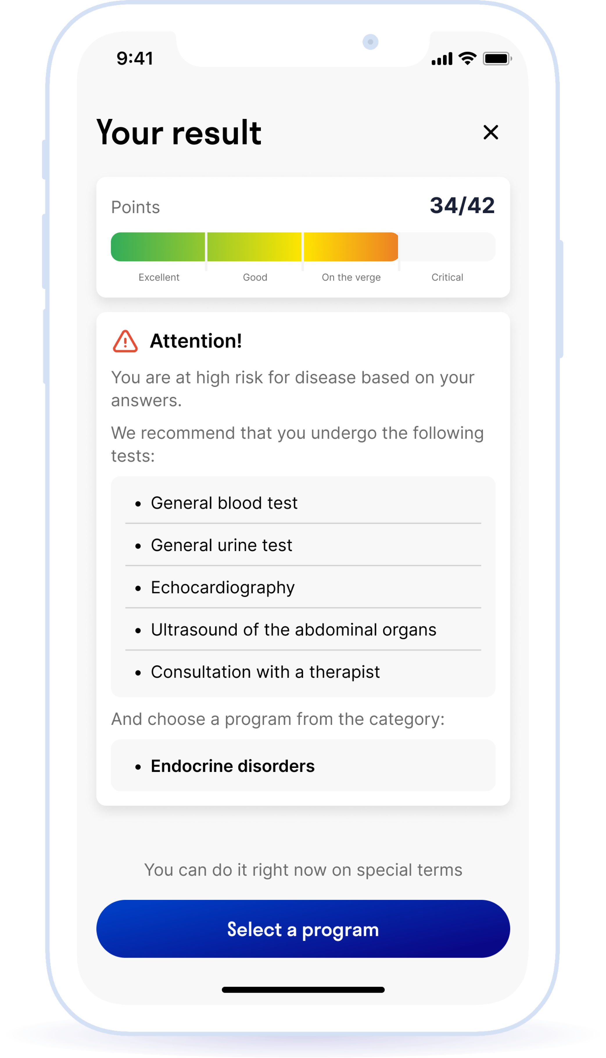
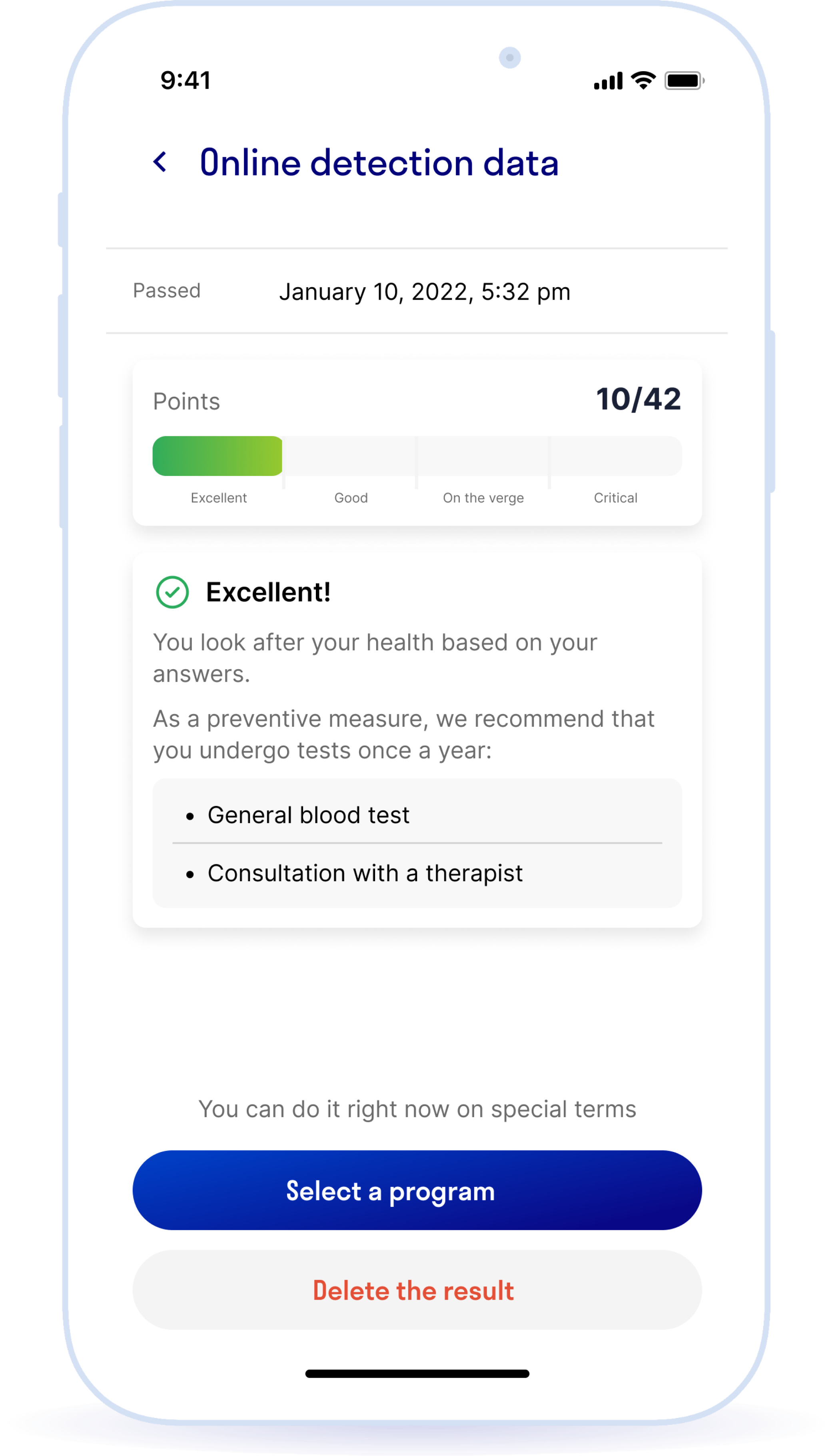
Each question has 3 or 4 options for answers. The user takes the survey in the app and receives a final score, which is calculated based on their age and answer scores. The customer is then categorized in one of the color zones: Green, Yellow, Red.
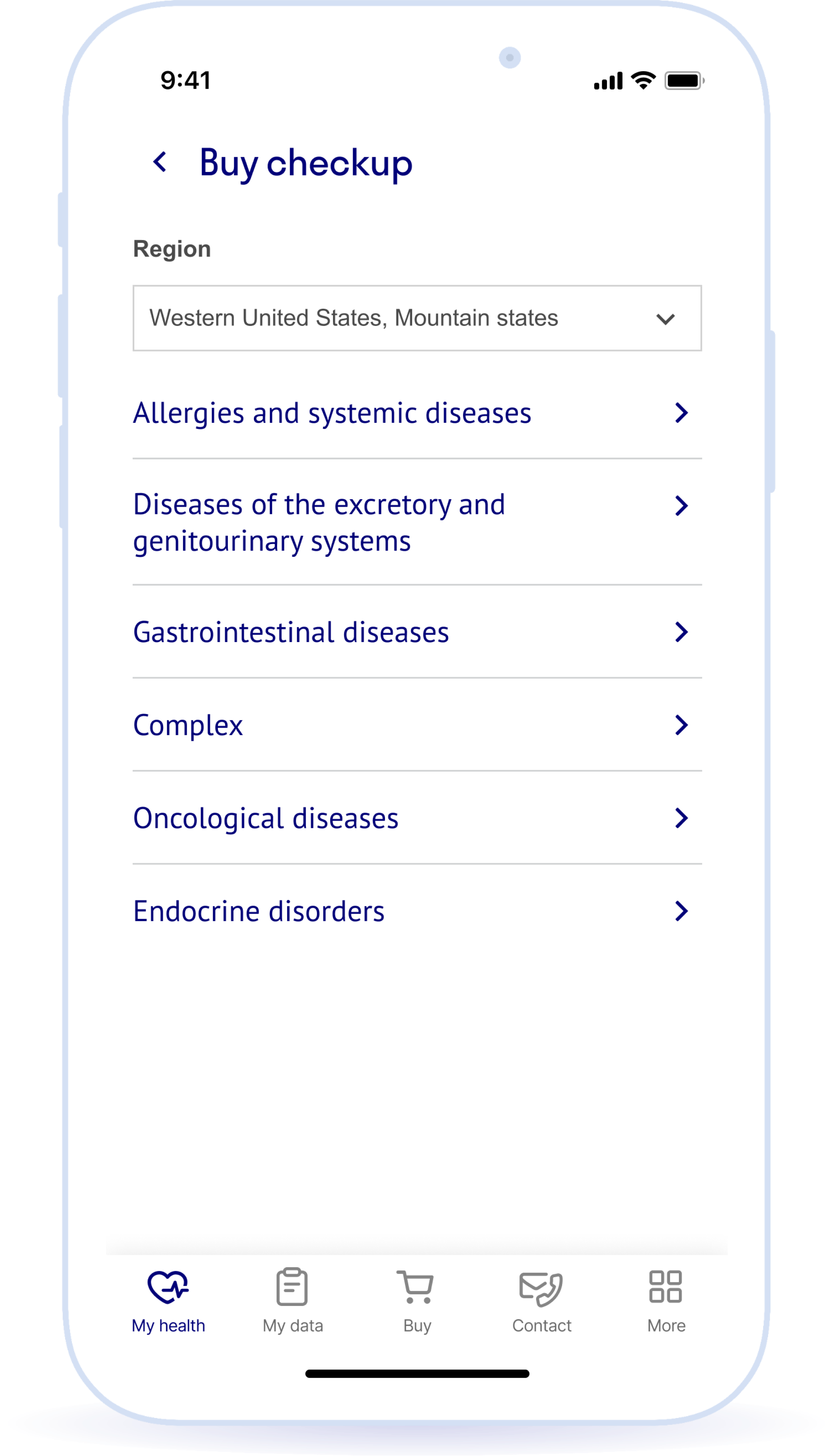
Some answers have an additional parameter indicating an increased risk of disease in their body’s systems: GI tract, cardiovascular system, and endocrine system. If a person selects an answer with this parameter, the application provides additional recommendations. For example, suppose the user responds that he smokes and is taking blood pressure medication. The service then recommends he undergo the “Cardiovascular system disease” checkup in addition to the primary examinations.
At first glance, the functionality seems rather limited, but it was important to consider a breadth of additional inputs.
– Create an MVP version of the functionality and test the hypothesis: Initially, it was unclear whether people would take the survey in the mobile app. The doctors provided a fairly extensive questionnaire. We adapted it to the smartphone screen format, coordinating the most important questions with the doctors. We were guided by the principle that there shouldn’t be too many questions, so as not to bore the user. At the same time, there needed to be enough of them to collect the necessary information and issue helpful recommendations.
– Limited range of users: The functionality is designed for users between the ages of 18 and 59. Children and elderly people get sick in a non-typical way, so it is better for them to consult a doctor right away. Age had to be taken into account in the survey results calculation formula. Also, clients who had already used up all their checkups under their VHI policy couldn’t be offered personal checkup offers. We reflected this point in the design.
– Architecture: Since several contractors were involved in the product’s development, all the existing architectural solutions had to be taken into account and the new functionality had to be fit into them so as to render them cost-effective for the business.
Main functionality:
- Survey completion
- "Traffic light" with survey results and checkup recommendations
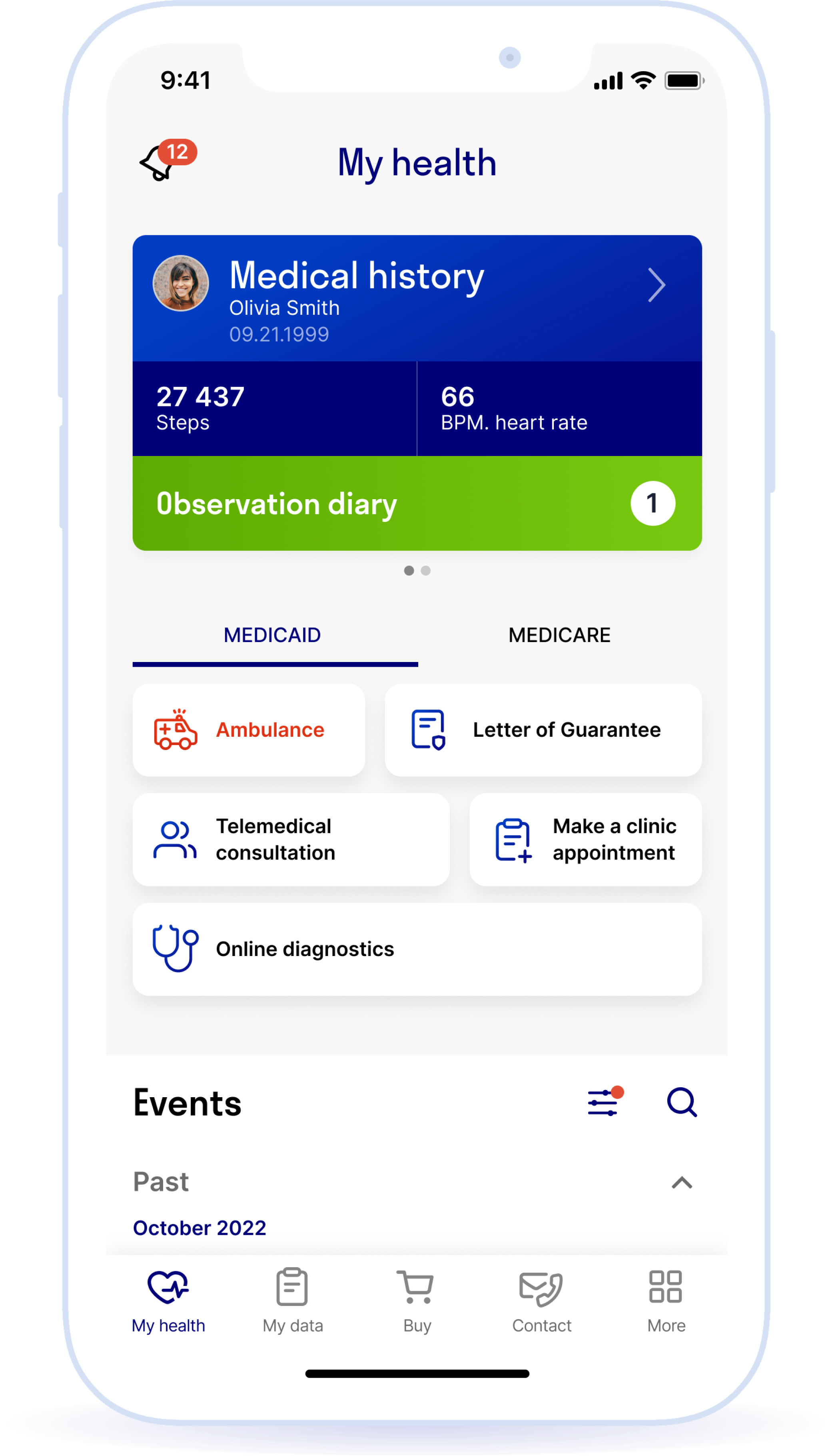
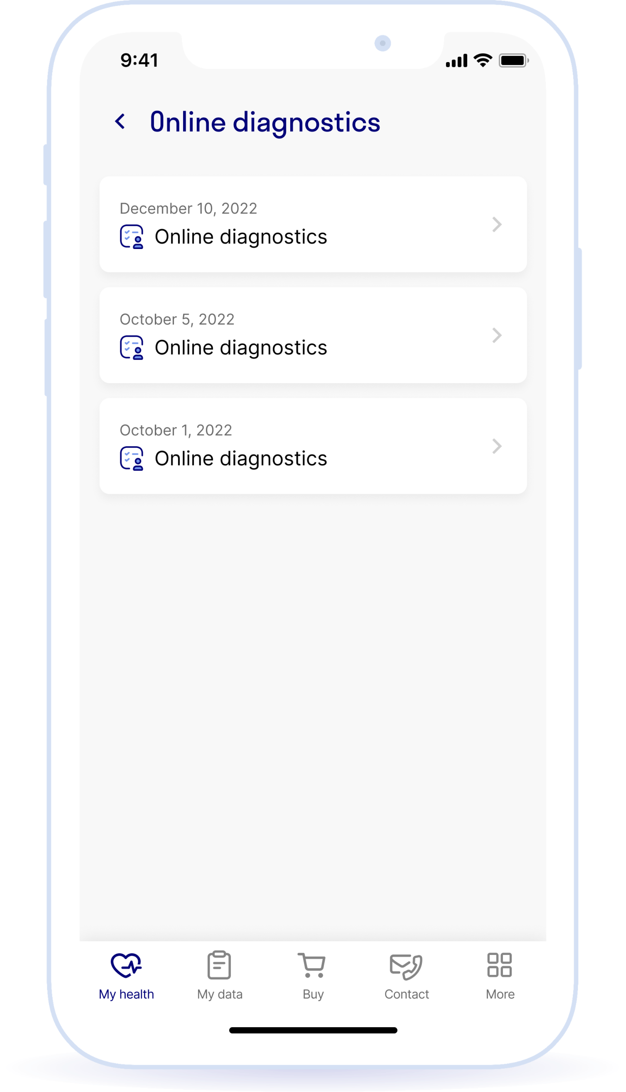
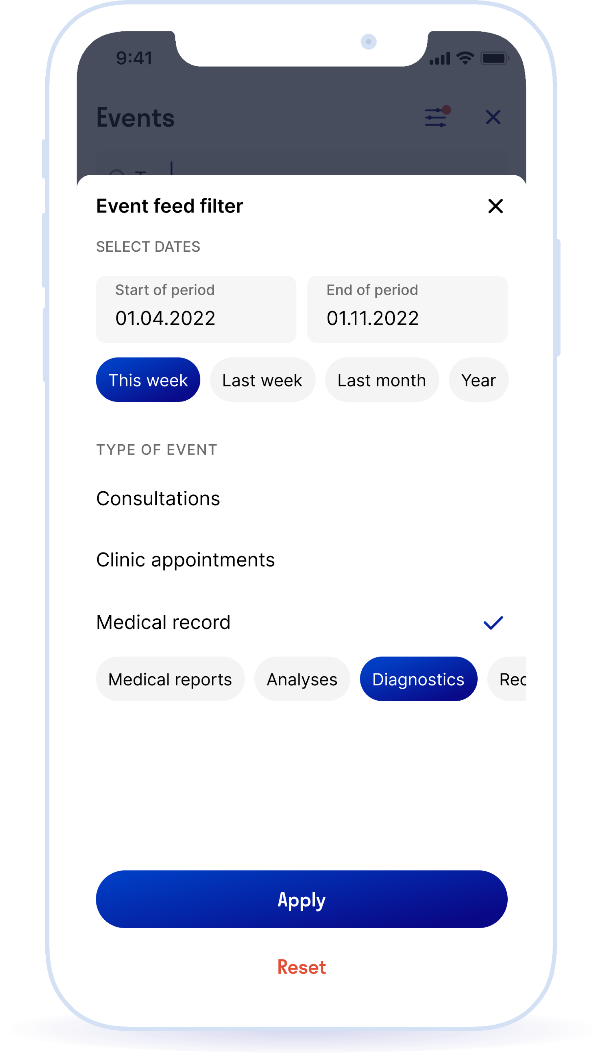
- Adding the online diagnostics results to the event feed
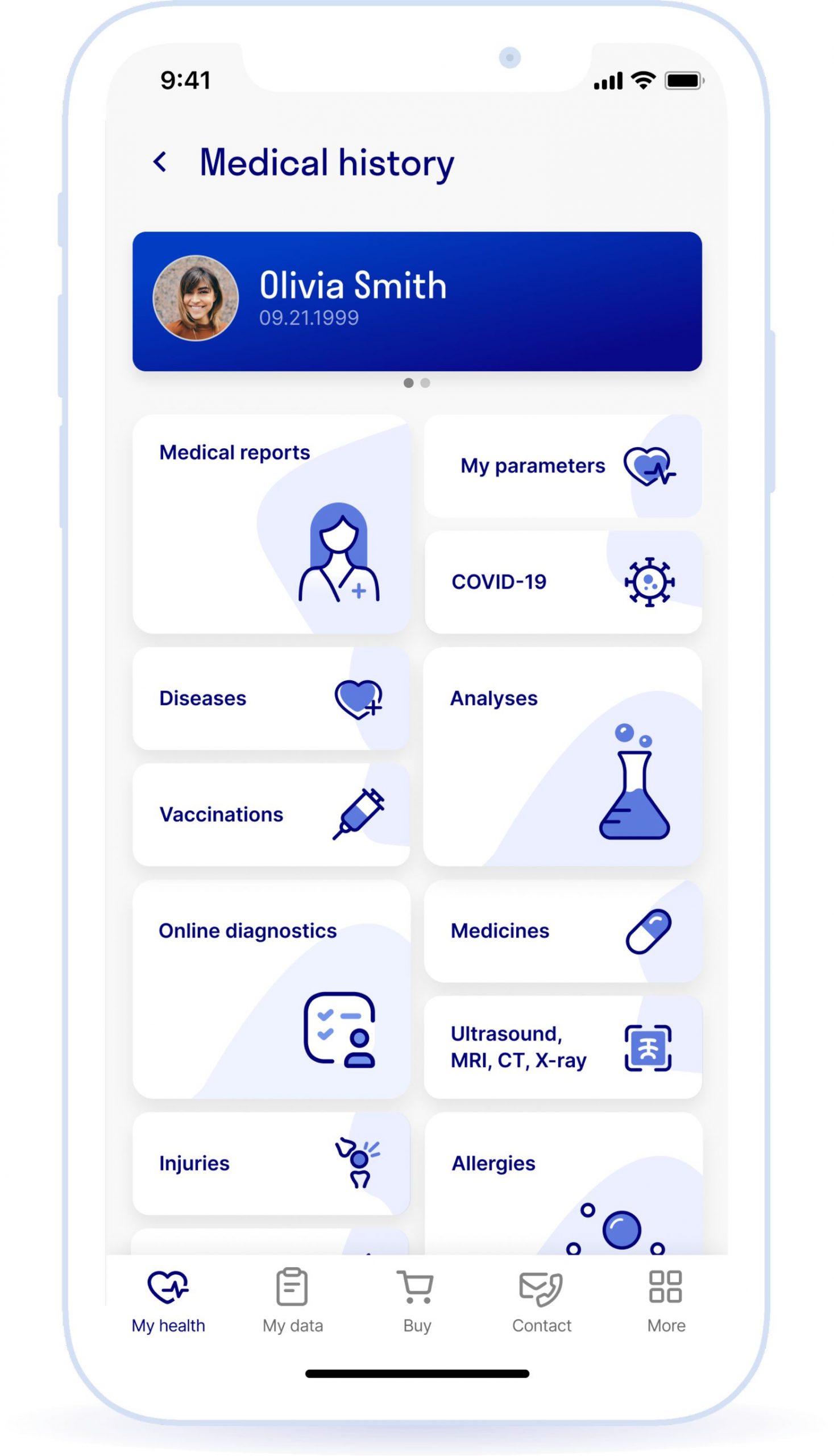
- An online diagnostics section with data from all the surveys in the patient's medical record
- Ability to delete survey results
UI Guide
The design was created based on the corporate identity and existing elements of the app. But, although we already had the basic elements, some screens took longer to work on. For example, it took us a long time to find a compromise between the text and visualization for the recommendations screen. We wanted to give as much useful information to the user as possible on a single screen, but it was inconvenient to read solid text. Thus, the visualization was born: a color scale, where the result of the survey is rendered clear thanks to a color code, some text, and lists containing recommendations.
The designers were always in touch with the client’s team and came up with options in a live discussion. Calls were conducted daily, feedback and wishes were collected, edits were made, and new options were presented the next day. An iterative approach was used until the best solution was achieved.
Color schedule:
Primary colors

Complementary colors

Headings and text
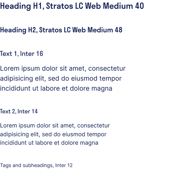
Other elements

Interface
According to legislation, a doctor has the right to establish a diagnosis and prescribe treatment only at a face-to-face appointment. At an online appointment, you can only correct previously prescribed treatment. This means we had to carefully choose the wording for the application screens so that the results of the online diagnostics would only contain recommendations.
